Themes 🎨 🤩
Not everyone likes to read on vanilla setup with white background and black text color. Therefore we'll add few awesome themes to choose from.
We'll setup two themes and some kind of control to switch between them.
Following are the steps we'll do for this:
- Define theme (no code. just thinking)
- Tell tailwind about the definition
- Create instances of the theme definition
- Refactor code to utilise these new themes
- Implement a control to switch themes
- Persist user selection
Theme definition
Theme is nothing but a set of colors that we apply to different parts of our website.
So the first thing we need to do is to decide following:
- a) What are the parts of the website for which we want to change color on theme switching?
- b) What all colors do we need for those parts? (we'll talk about this while creating theme instances)
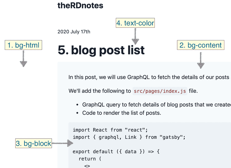
For this blog, I could think of following parts as of now:
- background color for the html
- background color for the content block
- background color the code section
- text color
Inform tailwind
Now that we have decided on the parts we want to color. Next step is tell tailwind about these variables.
For this we'll edit tailwind.config.js and extend the theme object by adding keys for these colors to it as follows:
module.exports = {
  corePlugins: {
    // preflight: false,
  },
  purge: ["./src/**/*.js", "./src/**/*.jsx", "./src/**/*.ts", "./src/**/*.tsx"],
  theme: {
    extend: {
      textColor: {
        default: "var(--color-text-default)",
      },
      backgroundColor: {
        html: "var(--color-bg-html)",
        content: "var(--color-bg-content)",
        block: "var(--color-bg-block)",
      },
    },
  },
  variants: {},
  plugins: [],
};
Theme instances
This is the fun part 🤩, where I get to play with colors to define different themes for our blog.
I am going to define two themes for now (may be more later bcz its fun):
- Vanilla (plain, default, basic white-gray based theme)
- Tang
And we'll assign color to each decided part per theme.
For this I've added following to a new file src/css/themes.css:
.theme-vanilla {
  --color-bg-html: theme("colors.white");
  --color-bg-content: theme("colors.gray.100");
  --color-bg-block: theme("colors.gray.200");
  --color-text-default: theme("colors.gray.900");
}

.theme-tang {
  --color-bg-html: #fffcf9;
  --color-bg-content: #fff4e8;
  --color-bg-block: #ffddbb;
  --color-text-default: #553344;
}
Notice how i am assigning color hex values in two different ways.
- In vanilla, I have used colors from tailwind
- In sunset, I have hardcoded the specific values
and imported it in src/css/index.css as follows:
@import "themes.css";
Using themes
We are all set to use the themes now. We just need to target the right html element and assign it the right className.
So basically, we need to assign className for:
- 4 background colors (
bg-html,bg-content,bg-block,text-default) - 1 theme name (
theme-vanillaortheme-tang)
bg colors
Following is how I've assigned the bg colors:
bg-html&text-defaultis assigned to the rootdivofLayout.jsbg-contentis assigned tomainelement ofContent.jsbg-blockis assigned tocodecss block insrc/css/unreset.css
theme name
- theme class is assigned to the root
divofLayout.js
Persist the theme !
useStatehook is used to store theme value inLayout.jswith initial value set tovanilla.localStorageis used to persist the user selected theme value.windowobject is being checked, because web APIs are not available while SSR (server side rendering)useEffecthook is used to write tolocalStorageand set thethemeNameto render the correct theme on first load.
So below is content of Layout.js:
function Layout({ children, title }) {
  const [theme, setTheme] = useState(() => {
    if (typeof window !== `undefined`) {
      let themeLS = localStorage.getItem("theme")
        ? localStorage.getItem("theme")
        : "vanilla";
      return themeLS;
    } else {
      return "vanilla";
    }
  });
  const [themeName, setThemeName] = useState("theme-vanilla");

  useEffect(() => {
    window.localStorage.setItem("theme", theme);
    setThemeName(`theme-${theme}`);
  }, [theme]);

  return (
    <div className={`${themeName} bg-html text-default`}>
      <Helmet title={title} />
      <div className="w-full max-w-4xl mx-auto flex flex-col min-h-screen font-sans">
        <Header theme={theme} setTheme={setTheme} />
        <main className="flex-1 px-2 py-2">{children}</main>
      </div>
    </div>
  );
}
Switch control
I am passing both theme and setTheme to Header.js, where I have implemented the controls to switch the theme:
import React, { useState, useEffect } from "react";
import { Link } from "gatsby";

function Header({ theme, setTheme }) {
  const [isMenuOpen, setMenuOpen] = useState(false);

  return (
    <nav className="">
      <div className="flex items-center justify-between px-2 py-3 ">
        <div className="">
          <h2>
            <Link className="no-underline" to="/">
              theRDnotes
            </Link>
          </h2>
        </div>
        <div className="">
          <button
            type="button"
            className="block text-gray-600 focus:outline-none"
            onClick={() => setMenuOpen(!isMenuOpen)}
          >
            <svg
              className="h-6 w-6"
              xmlns="http://www.w3.org/2000/svg"
              fill="none"
              viewBox="0 0 24 24"
              stroke="currentColor"
            >
              {isMenuOpen && (
                <path
                  // cross
                  strokeLinecap="round"
                  strokeLinejoin="round"
                  strokeWidth="2"
                  d="M6 18L18 6M6 6l12 12"
                />
              )}
              {!isMenuOpen && (
                <path
                  strokeLinecap="round"
                  strokeLinejoin="round"
                  strokeWidth="2"
                  d="M12 6V4m0 2a2 2 0 100 4m0-4a2 2 0 110 4m-6 8a2 2 0 100-4m0 4a2 2 0 110-4m0 4v2m0-6V4m6 6v10m6-2a2 2 0 100-4m0 4a2 2 0 110-4m0 4v2m0-6V4"
                />
              )}
            </svg>
          </button>
        </div>
      </div>
      <div
        className={`${
          !isMenuOpen ? "hidden" : ""
        } flex justify-between flex-row-reverse items-center sm:items-end bg-content rounded px-8 py-4`}
      >
        <div className="flex flex-col">
          <span className="text-xl font-medium pb-2 text-right">Themes</span>
          {["vanilla", "tang", "cappuccino"].map((themeName, index) => {
            return (
              <button
                type="button"
                key={index}
                onClick={() => setTheme(themeName)}
                className={`${
                  theme === themeName ? "bg-block" : ""
                } focus:outline-none text-right px-1`}
              >
                {themeName.charAt(0).toUpperCase() + themeName.slice(1)}
              </button>
            );
          })}
        </div>
      </div>
    </nav>
  );
}

export default Header;
FOUC
I am aware of flash of unstyled content (FOUC). But thats may be for some other time to fix!
Thats all folks!
HIH
Resources:
- Color schemes: Kindle
Following are the GitHub commits which represents what we've done in this post 🤩
Helpful?
If you think this is helpful 🎈
Don't keep it to yourself 🙊
Share it with your lovely followers at twitter 🗽
